The Best Mobile Banking Apps
What the best mobile banking apps do is look like they don’t come from a bank. Instead, Bank Director magazine found during interviews with the makers of some of the industry’s best banking apps that they looked for inspiration outside the world of banking—they looked for design cues from Facebook, Google, Amazon and Uber to create a totally digital, totally simple and easy way to bank. Because people are so accustomed to the features of companies such as Facebook and Google, those features become a benchmark that other apps are measured against. If you don’t have a search engine that auto-completes your searches, for example, it’s just not as good. Those companies define what’s intuitive, so if your app mimics them, it is more likely to win kudos from customers.
For the purposes of this ranking, we asked consultants and vendors to identify the best mobile banking apps. We further weeded out any apps we couldn’t try out, any non-U.S. banks, and any banks that didn’t receive at least a 4- out of 5-star aggregate rating from customer reviews in the Apple store.
 USAA
USAA
San Antonio, Texas
custom designed in-house
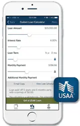
In part because of its customer base of military members and their families, USAA has been a vanguard for mobile banking apps in the country, introducing its first mobile banking app over six years ago. The bank introduced mobile check deposit back in 2010, which allows you take a picture of your check with your phone and deposit it remotely. Unlike many other great mobile apps in the country, which have limited capabilities focused on budget-conscious customers, USAA’s has the full functionality you would expect from a full-service bank. Not only can you pay bills and deposit checks, but you can get an insurance quote, chat with other members, get loan calculators, send documents and manage your investments. USAA also introduced an enhanced security feature that allows its mobile app users to sign in using voice, facial or fingerprint verification.
Chris Cox, the chief digital officer for USAA, says the bank is focused now on personalizing the experience. So, if you log in, the bank remembers what features you most often use, and will list those. Cox says he looks outside the banking industry for inspiration on what customers will expect and need from USAA’s apps, including Amazon, Google, the shared ride service Uber, and online shoe retailer Zappos.com.
 BankMobile
New York, NY and Wyomissing, PA
designed with Malauzai Software
BankMobile, which is launching a new, in-house app later this year, is purely a mobile and tablet banking option with a totally free checking account, and is a division of a traditional commercial bank, Customers Bank.
BankMobile President Warren Taylor said the idea got started several years ago when he and Jay Sidhu, CEO of Customers Bank, decided they wanted to create the Amazon of banking. The app is geared toward young people, as well as the unbanked and underbanked, and offers financial advice and help with budgeting. The bank saves money by not having branches, and makes interchange income from its debit card [there are no overdraft or ATM fees]. The bank had more than 100,000 customers a year after the launch, which is pretty good compared to a typical Customers Bank branch, which has about 150,000 checking accounts but usually takes years to achieve that amount. The basics are inside the app: person-to-person payments, mobile deposit and picture bill pay, but so is extra security in the form of an on-off switch for the debit card, so you can turn on the debit card only when you are about to make a purchase.
 Simple
Portland, Oregon
custom designed in-house
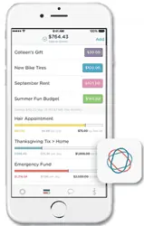
Simple, now part of BBVA, was a startup that launched an app in 2012 created by people who came from outside the world of banking, specifically Silicon Valley, including one of the first engineers for Twitter, Alex Payne. They were given years to come up with a customer-friendly, savings-focused app that was totally different from any other banking app. “We knew we wouldn’t get anywhere if we measured ourselves against banks,” says Ian Collins, Simple’s creative director. “It’s a pretty low bar.” Designers are focused on creating not just one of the best banking apps, but one of the best apps, period. Instead of showing a customer’s account balance, the app prominently displays a “safe-to-spend” dollar amount based on the customer’s own budget parameters, including upcoming bills. They invented the on-off security switch, so you can turn the debit card on and off inside the app and prevent fraudulent use of the card. Not only that, the app is elegant and beautiful to look at, blowing the other banking apps out of the water in terms of design. But it isn’t leaving marketing off the table. The debit card comes in the mail gift-wrapped in recycled cardboard. The app also includes an “add a friend” feature, so you can bug your friends to join Simple, and if they do, person-to-person payments are much quicker.
 GoBank
Pasadena, California
custom designed in-house
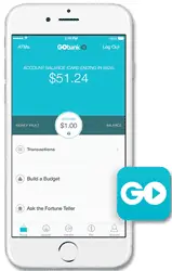
GoBank is a part of Green Dot Corp., which makes prepaid debit cards for the underbanked and unbanked. Both in-store banking and prepaid debit cards are available at Wal-Mart Stores, so it’s not completely branchless. There are no overdraft fees, but the account has a $8.95 per month fee you can waive if you direct deposit at least $500 per month. The app, which launched in January 2013, helps with budgeting in that it gives you an account balance on the lock screen of your phone before logging in, and it tells you whether you can afford certain purchases with light-hearted ribbing such as “Did you win the lottery?” You can set up text alerts if you spend more than a certain amount, perfect for couples trying to manage a budget together.
Sharon Pope, the chief marketing officer for GoBank, says CEO and founder Steve Streit wanted to give low and moderate income individuals better access to banking services, and purchased Loopt, an early GPS social gathering site similar to Foursquare, in order to get a team of engineers and designers. Like other mobile app developers, the team emulated what great apps were offering. “It takes me 10 seconds to find out what’s happening with friends on Facebook. We made it take two seconds to check your [account] balance.”
Capital One
McLean, Virginia
custom designed in-house
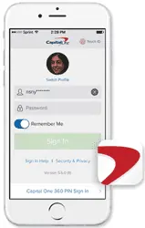
Capital One Financial Corp., which bought an Internet-only bank, ING Direct, in 2012, now has one app for all its retail customers. The app was designed in-house using the Kony platform, according to FI Navigator, which researches mobile banking apps. Capital One’s app allows you to put your photo on your account page, and trace a pattern on the lock screen in lieu of logging in with a user name and password. You can personalize your account page to show the accounts you care most about at the top of the page, and set up text or email alerts for low balances.
In the spirit of branchless banking, a Capital One 360 account offers no fees or minimum balances, and the free use of 38,000 ATMs. Unlike some of the other mobile-only banks listed in this article, a customer can deposit cash in the ATM. Capital One 360 also has eight cafes in major cities where customers can sip coffee, use the Wi-Fi connection or ATM, and take care of banking issues with a Capital One representative.

 USAA
USAA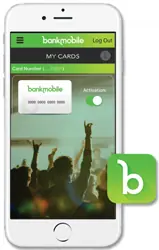 BankMobile
 Simple
 GoBank